The Design Museum based in Kensington high street has been open for nearly a year. we decided to pay it a visit.
Firstly, let me say that the design museum is an amazing building in terms of aesthetics. If you love great architecture (avid fan of Grand Designs) then you’ll appreciate the new building from its bold exterior to its minimalistic interior. A great improvement from the previous building, which felt cramped. Although the South Bank, Shad Thames, in my view was better due to its central location, the new home in Kensington, West London offers a much larger area to explore, with other great museums located nearby.
As soon as you enter the foyer you appreciate the large space and open plan layout. A hint of Nordic/ Scandinavian interior springs to mind when staring at the modern, wood paneling situated on the walls and stair case – and what a stair case! A clever use of seating combined with stairs, allowing the flow of people to constantly move to and from floors but also turning it into a communal area where people can sit and have conversation – nice.
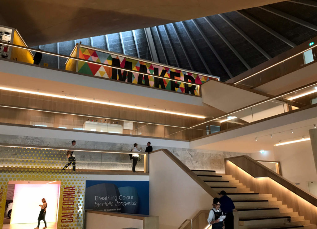
So heading through, I decided to have a coffee first before contemplating which exhibit to see. The café was located downstairs. Expecting to be over charged and drinking nothing more than a standard ‘so, so’ coffee I was pleasantly surprised. The coffee tasted pretty good, enough that I went back for a slice of cake and sat down admiring the oak interior that cocooned the café. Arching from the walls, across the roof to the other side were large wooden timber beams. I could hear Kevin McCloud in my ears, ‘isn’t this nice’. Yes Kevin, I would have to agree with you there. My pondering thought as I left was how could I incorporate this ceiling into my semi-detached house with low ceilings – I soon gave up on that idea.
Walking back to reception my wife and I (another designer with a keen eye) decided to go for the design exhibit ‘Designer Maker User’ which is the design museums free permanent display.
When you get to the 3rd floor where the exhibit is situated you are confronted by the hard-to-miss, dominant wall display that you get a peek of as you enter the building. ‘DESIGNER, MAKER, USER’ it says rotating like a bill board every few seconds. What an entrance. Not that the beauty is in the mechanic of this sign being rotated on its own axis, no we’ve seen all that before sitting at a bus stop catching the night bus home, but it’s at the sheer boldness of the language and words being displayed in large Sans Serif font – a great Snap Chat moment to be sure. At that moment, I was rather proud of the fact that as designers we were both part of a creative collective that actually design and make things for a living. Designer, maker, user – we were all three!
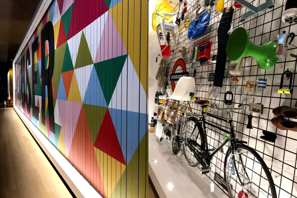
Walking across to the other side, another powerful display – a collection of more than 200 objects nominated by the public that have shaped the way we live, from a Vitra Eames DSW chair to a Converse trainer – iconic products to say the least. I half smiled at my wife knowing that a selection of these products were residing in our living room.
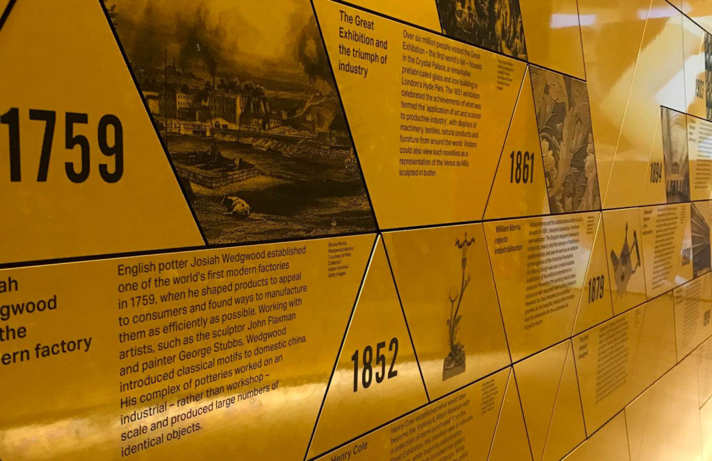
The entrance walk way leading to the main exhibit is a vibrant yellow with geometric shapes mapping out some of the world’s most important projects in a chronological time line dating back to the 1700’s. This is definitely worth reading if you have the patience. Not only is it insightful but you also start to understand how design has had a truly global impact across multiple disciplines. Feeling like Dorothy walking along the yellow brick road we follow the wall to the opening of the exhibition. Here we carry on in a traditional museum manor, slowly walking and weaving through the displays guiding you around a set path. Much of products and artifacts shown are interesting, but you can’t help but feel that the display is somewhat amateur, like final year University showcase. The captions were not short enough to be an easy read and not detailed enough to fully appreciate how the project was defined and brought to light. The ways in which the products are displayed unfortunately are nothing fancy. As a permanent exhibition you expect better displays given that this is not temporary. Perhaps there is too much on show as each product is very different from the next? moving from the history of the London underground map to the Air Zoom Mariah Flyknit trainer designed by Nike.
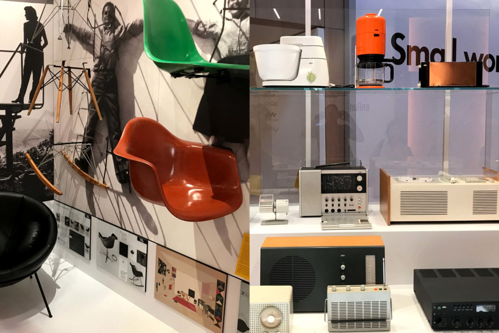
The exhibition goes on and showcases industrial and product design through varies mediums, looking at signage, furniture, fashion, and vehicles through to electronics, with historical mentions of design icons such as Vignelli and Rams. Sections are also dedicated to companies that have truly shaped everyday consumer products like Apple, Sony and Braun. Pockets of areas are visually engaging and you start to get excited again about design and the importance of it. Such areas as the Olivetti advertisement displays are a testament of how beautiful graphic design can be and if done well can stand the test of time. We finally get to the end of the exhibit where there is a workshop and meeting area where presumably students can sit and discuss what they have just seen.
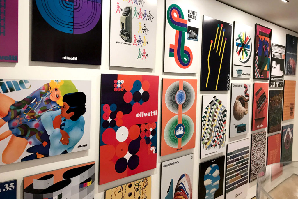
So was the exhibition good?
In my opinion yes and no. Yes for people who are new to design – non-designers, the public, tourists who want to understand more. Yes for school children, students who are thinking of studying the subject further and designers who want to understand product/ Industrial design in a fuller context. Sadly here lies the problem for people who don’t fall in these categories. Design as a subject matter is so vast that in order to cover all aspects the exhibition falls short of being truly great. It has ended up being a rounded overview rather than anything meaningful, especially for designers who work in the industry and take keen interest on the subject already. Yes, it did fill in some holes about design and gave me more insight in certain areas but it still only managed to scratch the surface.
The exhibit never truly engages you fully – but perhaps this was always its intent. A teaser, an appetizer – an introduction for you to explore the subject further beyond the confinements of the museum. Each area in my view should have been more visually engaging and communicated in way that was unconventional from a standard museum set up. It should have done more to captivate an audience.
That said, my wife had her own conclusion and summarised in her wise words, if I wanted more of a detailed topic of interest then I should view the paid exhibitions and pop-ups! – A very good point indeed.
‘Ferrari – under the skin’ – here I come!


