Logo designs are everywhere and on everything we see. They are applied on products we purchase and services we use. They are used to represent every company we interact with from global corporations to local businesses. They are a mark that allows us to understand what is being offered and by whom. As consumers, recognising a logo and the trust we place on what it represents will influence our purchasing decisions time and time again.
So what does a logo do?
The sole purpose of a logo is to identify. Without this it would be very hard to determine a product or service from another. They are the face of a brand and establish brand recognition. Once a company develops an ongoing trust with consumers, they can diversify into other products or services far more successfully as a direct result. They become synonymous with quality and are able to evoke a positive emotional response. Their brand logo becomes a signifier that these items hold true to the company values and quality it adheres to. However, this also holds true if the customer experience is a bad one and the product/service is poor.
Designing a logo
A logo essentially is an identifier. Having a bespoke identifier makes you more unique and makes it harder for others to replicate. It allows you to stand out in a competitive and sometimes saturated market. A logo can enforce standards and the expectations of a company. Coming up with a logo sounds easy enough but coming up with a great logo that’s timeless needs a little more thought.
Logotype vs Symbol Logo
There is no right or wrong answer in whether a logo should either be a type or symbol. This is very much a personal decision. if you do decide to incorporate both, you will need to decide when and how both shall be used, in what context and in what circumstances. i.e. on a website the composition of a symbol and type may have to be aligned differently in order to maximise space, compared to the arrangement on a letterhead.
The complexity of the logo should be kept clean and simple. People understand shapes and colour better than words as it is easier to process visually. if you do incorporate a logotype, keeping its look clean will allow consumers to digest and understand it quicker. This will also ensure that your logo can stand the test of time and doesn’t mean a costly rebrand in the future.

Example;
Google have made their logo cleaner and more simplified by using a sans serif font. The ‘G’ is more shape like in appearance than a letter and use vibrant colours.
Designing a logo in this way makes it easier for it to be transferred on to different applications without the need for modification. For instance, complicated Logos that have intricate shapes and a multitude of colours will not be able to be seen easily on a website header with a limited footprint compared to a logo printed on an exhibition banner. Therefore, the application of your logo is also a point to be considered.
Should your logo represent what you do?
Your logo doesn’t have to be an exact representation of what your business does and doesn’t have to be literal. Many company logos on first impression don’t actually give you an accurate reflection or insight on what their business does. Is this a bad thing? Not at all – this allows companies to expand in the future and develop different products and services without being confined to what their logo dictates. Once a consumer interacts with your brand and receives a positive experience, that connection is enough for them to understand what you are about and what your logo symbolises.

Examples;
Both Apple and Walt Disney logos have become synonymous with quality. The logos respresent a high standard in both product and service. They have diversified into many categories including electronics, gadgets, toys, theme parks, and streaming services.
Clever messaging
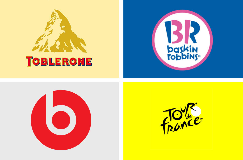
Logos can have clever hidden messaging through use of colour and negative shapes. Companies use this as a way of promoting their brand values and core messages. This is a great way of communicating to consumers in a subtle way without being too literal and direct. If you decide to take this approach, ensure that the message you promote is one that holds true and is core to your companies’ values.

Examples of clever messaging;
- Toblerone – the hidden bear on the mountain is a reference to the birthplace of the chocolate they produce.
- baskin robbins – the pink parts on the letters also show the number ’31’ in reference to the number of flavours.
- Beats – the ‘b’ also symbolises a person wearing actual headphones on their head.
- Tour de France – The ‘O’, ‘U’, ‘R’ on the white circle represents a person leaning forward on a bicycle.
Logo and Brand identity
A logo is the first step in establishing your company identity, what follows on from that is the brand identity. These are the colours/ fonts/ assets and elements that your company will use along with your logo to promote your products/ service or business. This will shape the overall look and feel and govern how your brand will look on packaging/ marketing material/ documentation and every other touchpoint that your business has with its consumers. This in some ways is as important as the logo as it reflects the type of company you are or aiming to be.
By understanding some of the considerations mentioned above, you can start to understand the importance of creating a logo whether it be for a service, product or business. Once developed it can enable you to stand apart from your competitors, elevate your business and allow for great brand recognition.


